
Great products don’t ask people to change how they live — they slip into lives already in motion. But you can’t design for a life you haven’t seen. Here’s how observing users in their real environment, instead of only asking them, reshaped the way we design at Mindster — with three real projects where a single moment of watching led straight to a better product.
Ask someone how they use your product, and they’ll give you an answer. A confident, reasonable, well-meaning answer. And it will often be wrong.
Not because they’re lying — but because most of what we do in a day, we do without thinking about it. We take shortcuts we’ve forgotten we take. We work around problems so smoothly we no longer notice them. Ask us to explain, and we tidy up the messy truth into a neat story that sounds right but isn’t quite real.
For a designer, that’s a problem. We want the products we build to slip quietly into people’s lives — and people won’t rearrange their day to fit our software. There’s a whole world happening around the few minutes someone spends tapping through a screen, and that world decides whether our design works or quietly fails.
So on our projects, we stopped relying only on what people say. We started watching what they actually do.
Asking vs. Observing
There’s a real difference between the two, and it’s bigger than it sounds.
Asking tells you what people think they want.
Observing shows you how they actually live— the habits, the shortcuts, the small frustrations they’d never think to mention because they’ve stopped noticing them. It’s a practice borrowed from anthropology, where researchers learned long ago that the most important truths about people are rarely the ones they announce.
Today it sits at the heart of good product and UX research.
Watching people in their own environment does a few things for us that no interview ever could. It builds genuine empathy, because we feel the context instead of imagining it. It surfaces needs users can’t put into words.
It reveals the clever little workarounds people invent to cope with bad tools. And it quietly exposes the assumption we were carrying into the project without realising it.
Table 1 — Asking vs. Observing: two ways to learn about users, and what each one reveals.
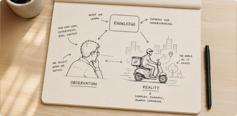
Figure 1- Observation reveals what interview often miss
Stop Designing for Assumptions. Start Designing for Reality.
Skip the guesswork. Partner with Mindster to turn real user habits into high-impact design.
Watching People “In the Wild”
Our favourite version of this is what researchers call naturalistic observation — studying people in the wild.
No lab. No script. No set of instructions to follow.
Just time spent alongside someone as they use a product in the messy reality of their actual day. We watch, and we write down what we see. It’s more reliable than a controlled test, because real life is where the real frictions live.
In a lab, people behave; In the field, the sun glares on the screen, the phone slips out of a gloved hand, the network drops at the worst moment — and that’s the experience we’re actually designing for.
It’s also where the best ideas come from, because watching real behaviour opens up possibilities you’d never think to test for in the first place.
The one rule we hold ourselves to, in the moment, don’t analyse. Just notice. What are people actually doing, versus what we assumed they’d do? What routines have they built around the product? How does it fit into the flow of everything else they’re juggling?
We record the details and save the interpretation for later — because the analysis, done too early, has a habit of confirming what you already believed.
Here’s what that looked like on three of our projects.
From Observation to Design: Three Projects
Malabar Gold — Designing for Gloved Hands and Fast Floors
We visited the Malabar Gold factory in Dubai and spent time on the production floor, watching how workers and supervisors operate in a fast-moving manufacturing environment.
Interviews alone would never have told us what an hour of standing there did.
The first thing we noticed was their hands. Most workers wore protective gloves throughout their tasks — which instantly changed how we thought about touch.
Small buttons and tightly packed controls were out. We designed for larger touch targets, generous spacing, and interactions comfortable to hit without removing a glove.
We also watched where they kept their handheld devices between tasks, and how quickly they needed to glance at a screen and move on.
The floor rewards speed, so we stripped the interface down to a clear visual hierarchy and high readability, surfacing only what mattered at each stage and nothing more.
And by following how work travelled from one station to the next, we understood the supervisors’ world too — how they assign tasks, track progress and manage a floor where people constantly switch between jobs — letting us design workflows around their real responsibilities and the genuine bottlenecks in production.
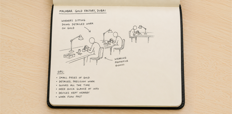
Figure 2 — On the factory floor: what we observed on the left shaped what we designed on the right.
ID Fresh — Designing for the Street, Not the Desk
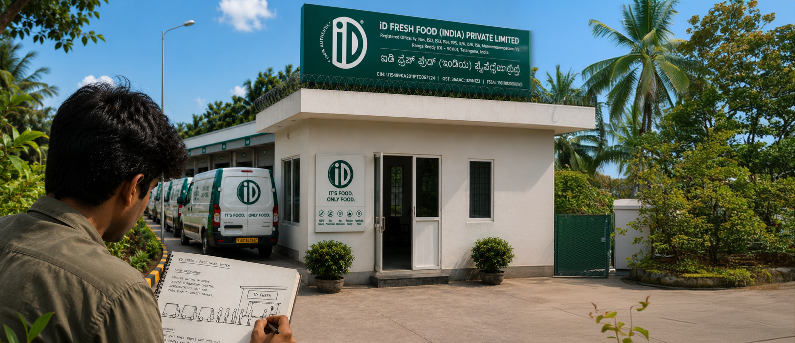
For ID Fresh’s field sales system, we didn’t sit with the data — we walked the routes.
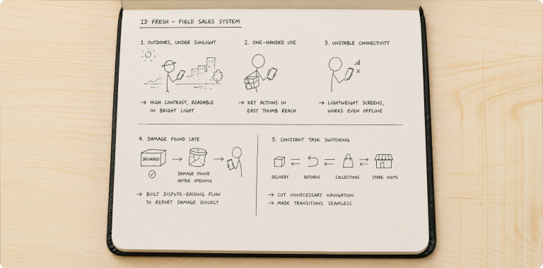
Travelling alongside sales representatives, we saw that a huge part of their day happens outdoors, under direct sunlight. So we pushed contrast higher, chose colours that survive glare, and tuned the screens for readability in bright light.
We noticed they usually operate the app one-handed — the other hand busy with products or a store owner — so we pulled the key actions into easy thumb reach. And because connectivity swings wildly from one stop to the next, we kept screens lightweight so the experience holds up even when the signal doesn’t.
Then came the insight we could only have found on the road.
Product damage, we learned, is often discovered after the containers are opened at the destination — long after the delivery is logged. That single observation led us to build a dispute-raising flow, so damaged goods can be reported quickly instead of falling through the cracks.
Shadowing them for full days also showed how constantly they switch between deliveries, returns, collections and store visits, so we cut the unnecessary navigation and made those transitions seamless — designing around the mental models they already had, rather than forcing new ones on them.
Fitreat Couple — Turning Real-World Habits Into Features
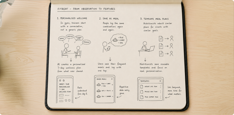
With Fitreat Couple, we watched how nutritionists, coaches and gym trainers actually work with their clients — and three quiet observations turned directly into product features.
- A personalised welcome: In gyms, we noticed trainers almost never hand a new member a generic plan. They start with a conversation — goals, lifestyle, fitness level, struggles — and then suggest something tailored. So instead of ending onboarding with a flat confirmation screen, we used AI to generate a “Here’s Your Personalised 7-Day Wellness Plan” from what the user shared. Users felt understood from the very first screen.
- Save as Meal: Watching people log food, we saw the same combinations typed in again and again — the usual rice, curry and vegetables, or the same daily breakfast. Since those combos differ from person to person, presetting them wasn’t practical. So we let users save their own frequent meals and log them with a single tap. Repetitive data entry, gone.
- Template meal plans: In our research with nutritionists, we noticed clients with similar goals kept receiving near-identical plans — yet each one was rebuilt by hand. So we let nutritionists save reusable templates, cutting the busywork and freeing them to spend their time on real personalisation instead of retyping the same plan.
The Takeaway
Across all three projects, observation taught us the same lesson.
Good design isn’t about digitising the workflow someone describes to you. It’s about understanding how people actually behave — the constraints they work within, the effort they repeat without noticing, the shortcuts they wish they had — and then quietly removing the friction.
When you design from what you saw instead of what you assumed, the result feels familiar, saves time and fits so naturally that people barely notice the design at all.
That’s exactly the point.
At Mindster, this is how we approach every product we build — by stepping out of the office and into the real world our users live in, because the best insights are never the ones people can hand you. They’re the ones you have to go and watch.
Ready to Build a Product Your Users Will Actually Love?
Build software grounded in authentic user habits. Partner with Mindster to deliver an intuitive experience that keeps users coming back!
Get Your Free Consultation today
Mishal Aboobacker is a UI/UX Designer, dedicated to building intuitive, human-centered digital experiences by blending creative strategy with clean engineering. A natural innovator, his early technical achievements include winning Meta’s Global SparkAR World Competition.Deeply invested in cultivating the creative ecosystem, Mishal serves as a Co-organizer for the Friends of Figma (FoF) Kozhikode community. Beyond his day job, Mishal is a committed design mentor and a Co-organizer for Friends of Figma Kozhikode, where he actively contributes to cultivating the regional design ecosystem.