


Digital accessibility means designing and building websites and mobile apps so that people with different abilities — visual, auditory, motor, or cognitive — can perceive, understand, and interact with them without extra effort. It’s measured against WCAG (Web Content Accessibility Guidelines), the internationally recognized standard, and it benefits far more people than most teams assume: users with permanent disabilities, people with temporary impairments (a broken wrist, eye surgery), and anyone working in a tough environment — bright sunlight, a noisy room, a shaky hand on a moving train.
- Accessibility isn't a compliance checkbox — it's product design that benefits users with permanent disabilities, temporary impairments, and situational limits (bright sun, noisy room, one-handed use) alike.
- It carries real business stakes: 3,117 federal accessibility lawsuits in 2025 (+27% YoY), while disability-inclusive companies outperform peers financially — and 1.3B people worldwide is not a niche market to ignore.
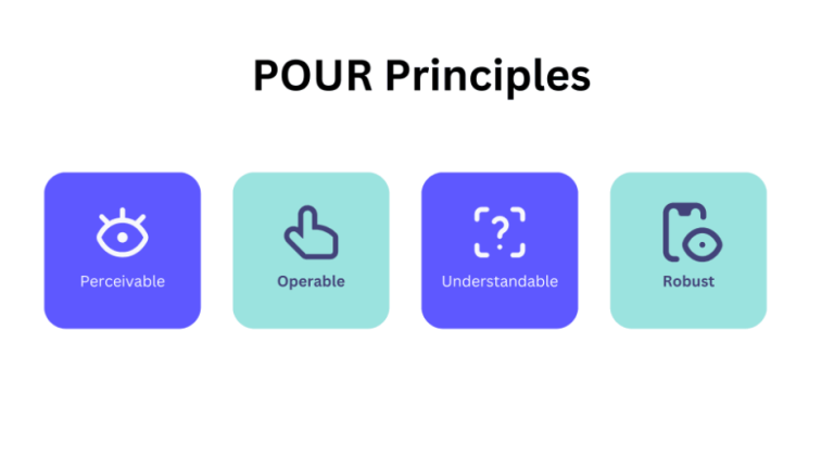
- WCAG's four principles (POUR — Perceivable, Operable, Understandable, Robust) are the standard everything else in the piece hangs off.
- Mobile accessibility adds touch target sizing and dynamic font scaling on top of everything web accessibility already requires.
- Testing needs three layers: automated tools, manual keyboard-only testing, and real screen reader testing — automated alone catches only a fraction of real issues.
By the numbers: The 2026 WebAIM Million report found that 95.9% of the top one million home pages on the web still have at least one detectable WCAG 2 failure — an average of 56 errors per page, up from 51 the year before. Globally, the WHO estimates that 1.3 billion people, or 16% of the world’s population, live with a significant disability. Accessibility isn’t an edge case. It’s a mainstream design requirement.
For developers, accessibility shouldn’t be something checked right before production — it belongs in design, development, testing, and release alike. For business leaders, it belongs in the product roadmap and the budget conversation just as early.
The Business Case for Accessibility
Accessibility used to get filed under compliance and left there. The numbers now make a broader case — and they cut two ways: risk and revenue.
Legal exposure is rising, not falling.
Plaintiffs filed 3,117 website accessibility lawsuits in U.S. federal court in 2025 — a 27% jump from 2,452 in 2024, following two prior years of decline. E-commerce and retail remain the most targeted sectors.
And it isn’t only a U.S. story.
The EU’s European Accessibility Act has applied to services including e-commerce since June 2025. In the U.S., state and local government websites now fall under a dedicated ADA Title II rule tied to WCAG 2.1 AA, with compliance deadlines phasing in through 2027–2028. For teams building for a global user base, “which accessibility regulation applies to us” is now a real question, not a hypothetical.
Inclusion correlates with stronger financial performance.
Accenture’s research on the Disability Equality Index found that companies leading on disability inclusion generated 1.6x more revenue, 2.6x more net income, and 2x more economic profit than their peers, alongside 25% higher productivity.
The addressable market is not niche.
1.3 billion people worldwide live with a significant disability. That’s a market routinely locked out of digital products by fixable design choices, not by necessity.
It also feeds your own discoverability.
The same structural habits that make a page usable for assistive tech — semantic headings, descriptive alt text, plain language — are what search engines and AI answer engines lean on to summarize or quote a page accurately. Accessible content tends to travel further: across search, voice, and AI overviews, not just to more people.
Put together: accessibility now sits at the intersection of legal exposure, brand trust, addressable market, and how discoverable your content is in the first place. Treating it as optional is, itself, the riskier bet.
What Is Digital Accessibility?
Consider a simple login button:
<button>Login</button>
A sighted user immediately understands it’s a button. A screen-reader user needs the same information through a different channel — what the element is, what it does, whether it’s currently available, and whether its state has changed. Accessibility is the practice of making sure information available visually is also available through other interaction methods.
Web Accessibility & the Four WCAG Principles
| Principle | What it means | Common mistake |
|---|---|---|
Perceivable |
Information is presented in a way users can perceive, not just see |
Using color alone to signal an error (❌ red text) instead of also stating it (✓ "Email address is required") |
Operable
| Every interaction works across keyboard, mouse, touch, screen reader, and switch devices
| Building a clickable <div> instead of a real <button>
|
Understandable | The app behaves predictably, with clear labels and error messages
| Showing "❌ Invalid input" instead of "✓ Password must contain at least 8 characters"
|
Robust
| Content works reliably across browsers, OS’s, and assistive tech
| Custom components that break with screen readers or browser accessibility APIs
|
The current version, WCAG 2.2, builds on 2.1 with nine additional success criteria — covering things like keeping focus indicators visible, minimum touch target size, not forcing users to re-enter information they’ve already given, and consistent placement of help across a flow. If your team is picking a target version in 2026, 2.2 is the practical baseline.
A quick example of the Operable principle in practice — this looks like a button but isn’t one from an accessibility standpoint:
<div onClick={handleSubmit}>Submit</div>
Native HTML elements come with accessibility behavior built in. Prefer:
<button onClick={handleSubmit}>Submit</button>
Use semantic HTML whenever possible — it’s the fastest way to satisfy all four principles at once.
Keyboard Accessibility
A user should be able to navigate an entire application without a mouse. Standard interactions:
- Tab → move forward
- Shift+Tab → move backward
- Enter → activate
- Space → activate certain controls
- Esc → close dialogs/menus
- Arrow keys → navigate certain widgets
Before shipping, check:
- Can every interactive element receive focus?
- Is the focus order logical?
- Is the focus indicator visible?
- Does focus move correctly when the UI changes?
A visually polished application with poor keyboard navigation is still an inaccessible application.
Screen Reader Accessibility
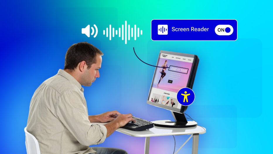
Screen readers — NVDA, JAWS, VoiceOver, TalkBack — don’t simply “read the screen.” They rely on the semantic structure and accessibility information the app exposes.
<!-- Establishes a meaningful label-input relationship -->
<label for="email">Email address</label>
<input id="email" type="email">
<!-- No programmatic relationship — a screen reader can't connect these -->
<div>Email address</div>
<input>
Images and Alternative Text
Images need alt text when they convey meaningful information:
<img src=”profile.jpg” alt=”John Smith”>
Decorative images can use empty alt text (or aria-hidden, to hide them from assistive tools entirely):
<img src=”decorative-line.svg” alt=””>
The goal isn’t describing every visual detail — it’s giving users the information they need to understand the content.
Forms and Accessibility
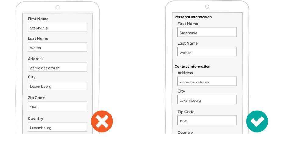
Forms are one of the most common places accessibility breaks down. An accessible form needs:
Clear labels
<label for=”phone”>Phone number</label>
<input id=”phone” type=”tel” />
Clear, specific errors — instead of “❌ Error,” say what’s wrong and how to fix it: “✓ Enter a valid phone number, including your country code.”
Proper error association, so assistive technology can tell:
- Which field has the error
- What the error is
- How to fix it (via helper text)
- Focus shifts programmatically to the error field
It’s also worth noticing where teams stop looking. Marketing pages tend to get the accessibility pass; checkout, onboarding, account settings, and authentication often don’t. Those are exactly the flows where a user is trying to complete something involving their money, time, or access — they deserve at least as much scrutiny as the homepage, not less.
Don’t Overuse ARIA
ARIA is powerful, but it shouldn’t be your first move:
<!– Avoid –>
<div role=”button”>Save</div>
<!– Prefer –>
<button>Save</button>
Native HTML elements already carry semantics, keyboard behavior, and accessibility information for free. Reach for ARIA only when you’re building custom components that native HTML genuinely can’t express.
One more shortcut worth naming: accessibility overlay widgets — the scripts that promise instant compliance — don’t reliably fix broken semantics, missing labels, or poor focus order. They can add surface-level controls, but the underlying markup still has to be correct. There’s no substitute for building it right the first time.
Has Anyone Tested This With a Screen Reader?
Most teams never check. Send us your app and we'll tell you straight.
Get a Straight AnswerMobile Accessibility

Accessibility doesn’t stop at the browser. iOS ships VoiceOver; Android ships TalkBack, but mobile accessibility involves more than screen readers. It also covers touch target size, accessibility labels and hints, focus/navigation order, dynamic text sizing, and colour contrast.
Touch Targets Matter
Tiny icons packed close together might look fine visually but are genuinely hard to activate — for anyone, not just users with motor impairments. Give interactive elements (buttons, checkboxes, radio buttons, pagination, input fields, dropdowns) enough size and spacing.
Dynamic Font Scaling
Users often increase system font size because small text is hard to read. If an app uses fixed dimensions everywhere, larger text can cause text to get cut off, content to overlap, or tasks to become impossible to complete. Design for scalable text from the start — this is especially important on mobile, where users configure font size at the OS level, outside your app’s control.
Accessibility Testing: Three Layers You Need
- Automated testing— tools like Axe, WAVE, the ANDI extension, and Lighthouse catch missing alt text, invalid ARIA attributes, missing labels, insufficient contrast, and invalid HTML structure. Useful, but not sufficient on their own automated tools only catch a fraction of real-world issues. Even a perfect Lighthouse accessibility score is a weighted audit result, not a full human judgment of usability, treat it as a starting point, not a finish line.
- Keyboard testing—literally disconnect the mouse and try to complete key workflows. This one exercise surfaces an outsized number of accessibility problems fast.
- Screen reader testing— test complete user journeys, not isolated components, using NVDA, JAWS, orVoiceOver on web, and VoiceOver or TalkBack on mobile.
Accessibility Is a Team Responsibility
It doesn’t belong to developers or QA alone — it runs through the whole product lifecycle.
- Designers consider contrast, typography, focus states, error states, responsive behavior, touch targets, animation, and overall user experience.
- Developers implement semantic HTML, keyboard interaction, ARIA where necessary, accessible component choices, and proper focus management.
- QA validates keyboard navigation, screen readers, zoom/text scaling, and behavior across devices.
- Leadership sets the expectation that accessibility is a product requirement, not a stretch goal — budgeted and staffed like any other quality bar, not squeezed in after the fact.
Treating accessibility as a final QA checklist is one of the most expensive mistakes a team can make — retrofitting it into components, navigation, and design systems after the fact costs far more than building it in from day one.
A Practical Accessibility Checklist
Web
- Semantic HTML is used throughout
- Keyboard navigation works end to end
- Visible focus indicator exists, with proper focus management
- Images have appropriate alt text
- Forms have accessible labels, error text, and programmatic focus-on-error
- Errors are specific and understandable
- Color isn’t the only source of information
- Contrast meets WCAG minimums
- Screen reader verification is complete
Mobile
- Screen-reader labels are meaningful
- Touch targets are sufficiently large and spaced
- Text scaling works without breaking layout
- Focus/navigation order is logical
- Color isn’t the only indicator
- Important gestures have accessible alternatives
- VoiceOver/TalkBack testing is complete
What This Looks Like at Scale
Accessibility gaps get more expensive the more users you have. When you’re running a platform like C3Pay — the WPS-compliant payroll card program we built for Edenred UAE, now serving 1.6M+ active users and processing over 2M salary transactions a month — a single unlabeled input or keyboard trap isn’t a minor bug. It’s a real transaction a real person couldn’t complete. At that scale, “does it work for most people” isn’t a good enough bar.
Final Thoughts
A keyboard user might have a permanent disability or might simply prefer the keyboard. Someone increasing font size might have a visual impairment or might just be using their phone in bright sunlight. Someone relying on captions might be deaf, or might be watching a video in a noisy room. That’s the real case for accessibility: it’s not a feature for a narrow group, it’s better product design for everyone who touches your product.
The shift worth making is from asking “does the application work?” to asking “can everyone use it?” That’s not a compliance checkbox — it’s part of what building a quality digital product actually means.
If you’re building a mobile or fintech product for a large, diverse user base, accessibility deserves a line in the roadmap and the budget from day one. It’s a fraction of the cost to build in early compared to retrofitting it later — after a compliance letter, a bad app store review, or a customer who simply couldn’t complete a transaction forces the issue.
A Customer Couldn't Finish Checkout Today
They didn't complain. They just left. Let's make sure your customers don't.
Talk to Our Team
Technical Manager – Web Projects with over 5 years of experience in web application development, specializing in frontend architecture and scalable digital solutions. Passionate about building high-performance, user-centric applications, they lead cross-functional teams, drive technical decisions, and ensure the delivery of reliable, accessible, and maintainable web projects. Their expertise also extends to full-stack development, modern development workflows, and mentoring teams to build innovative digital experiences.


