Being a UI/UX design company, one should consider micro-interactions on UX/UI Design. After all, user experience is a top goal. Moreover, what more effective approach to achieving it than by incorporating amusing interactions and little interactive features throughout the product? Micro interactions are one of the crucial elements in the realm of user experience (UX) design.
Micro interactions are small features that make a product more fun and simple to use, enhancing the user experience even when the consumer isn’t even aware of them. Although most of them go unnoticed, micro-interactions on UX/UI design are prevalent in the digital transformation era.
We have micro-interactions on UI/UX design every day, starting with the phone ringing when we wake up and continuing with checking to see whether the message alert is from someone we know. They are necessary to finish a user’s journey and provide the intended effect. Hence, let’s learn more about micro-interactions, their significance, and how micro-interactions impact UX/UI design.
What are Micro-interactions?
Micro-interactions are discrete times when a customer and the product design communicate. They are brief, useful graphics that assist the consumer by providing visual cues and making changes easier to see. They primarily serve a single objective; to please customers by producing an exciting, hospitable, and interesting encounter.
Micro-interactions allow for spoken interaction. Wherever you look, you can observe micro-interactions, such as a loading bar that indicates the action you took is under consideration and the sparks popping up when it is finished. All micro-interactions, or those that include them in some way, involve swiping, scrolling, and clicking; continuing over items; liking, sharing, and storing; adjusting the speakers on and off; and muting and unmuting your phone.
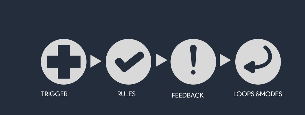
4 Components of Micro-interactions
Micro interactions can be auditory or visible, ranging from detailed graphics to intricate procedures. The user can activate the interactions by doing anything as easy as tapping an icon or pressing a screen. Let’s examine what micro-interactions include.

- Trigger
The user action triggers certain events, such as pressing a button or swiping a screen, that start the micro-interaction. The system also produces triggers. A toggle switch is a trigger that switches a feature on and off.
- Rules
A rule specifies the sequence of events before, during, and after a micro-interaction in response to a trigger. A torch app, for instance, uses a button as the trigger to switch between on and off of the light
- Feedback
The reaction to the trigger is known as feedback, and it informs viewers of the procedure that was done and what is currently going on by sending an acknowledgement. The user receives feedback telling them of the results of the micro-interaction.
A signup form with inline validation illustrates feedback; the border color changes from red to green depending on whether the field has been filled out accurately or inaccurately. In this manner, the user is always aware of what is correct or incorrect.
- Loops & Modes
Loops and modes define the meta-rules of the micro-interaction and the way it adapts over time. For instance, a “Buy it now” button in an eCommerce app can switch to “Buy another” if the consumer has already purchased the item.
By keeping them straightforward, simple to grasp, and aesthetically pleasing, designers employ micro-interactions to develop intuitive and interesting user experiences.
Micro interactions assist consumers in navigating the product. They provide a platform of individuality and character, which helps establish a strong sense of brand identification and a psychological bond with customers.
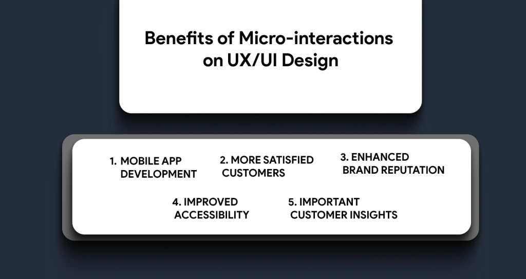
Benefits of Micro-interactions on UX/UI Design
These seemingly little details have a bigger influence than they would first appear to have. However, they may significantly affect the user’s overall experience. Discover the advantages of a thoughtfully constructed micro-interaction on UI/UX design for you by reading ahead.

1. Greater Customer Interaction
Micro interactions on UI/UX design can improve a customer’s satisfaction and delight with a platform, resulting in greater participation and adoption. They empower customers to get involved with and discover a product, learning about novel features they were unaware of. More involvement and greater comprehension of the product result from this procedure.
Take a look at a few ideas for enhancing customer involvement when using a product:
- Animation
You may provide users with a more interactive and intriguing journey using animation. Think about creating a dynamic loading or scrolling process. Create a mobile app animation design and keep interactivity in mind.
- Personalization
Micro interactions that are personalized depending on customer needs enhance customers’ perceptions of your brand. In this case, it’s important to understand your intended audience, ensuring you provide good content to satisfy consumers’ demands and requirements.
- Surprising effect
A more pleasant experience is produced by including unexpected or surprising features. You might have some animation after a task is finished. However, be careful; too many interactions may frustrate or mislead a user.
2. More Satisfied Customers
For the product to succeed, micro-interaction contentment is essential. A pleasant micro-interactions on UX/UI design is produced through well-built micro-interactions, which also increase usability and foster a sense of association with the product.
On the other hand, negative feedback results from inexperienced micro-interactions. Designers should produce interesting, logical, and reliable micro-interactions to increase customer happiness. They have to be created to offer quick feedback across the whole product.
They can also be provided with a customer loyalty program to be more engaging. Customer loyalty programs that use the best UI/UX Design helps develop satisfied customers through more engagement to retain the users. Remember the psychological impact of micro-interactions and try to design interactions that make people feel good.
3. Enhanced Brand Reputation
Let’s look at what one can accomplish for effective branding to discover how little connections may have a big impact on a company’s identity. Micro-interactions on UX/UI design may strengthen the brand’s reputation, among other things using continuous design features. The consistency of the color scheme, typeface, and drawings used in various micro-interactions can help establish the brand’s distinctiveness.
Despite only a brief interaction, it can aid people in recognizing and remembering the brand. Micro interactions can assist brand principles as well. For example, a fitness app may use animated graphics and upbeat music effects to support its brand value of encouraging a healthy way of life.
4. Improved Accessibility
Micro interactions on UX/UI design improve efficiency by offering consumers targeted input and direction during their time with a product. They simplify things by dissecting difficult procedures or operations into smaller, easier-to-handle pieces. Viewers are informed whenever an action is carried out effectively, or an error happens. This input enhances the product’s usefulness by reducing annoyance and preventing design flaws.
Micro interactions, as we’ve already said, inform consumers of the current state of a job or process by letting them know how far they’ve come and how many steps remain. By streamlining the procedure and enhancing convenience, consumers will have a better experience doing a particular activity.
5. Important Customer Insights
When creating micro-interactions, user observations are essential because they give designers important knowledge about consumers’ requirements, behaviors, and desires. Developers may produce engaging interactions by integrating user feedback into the mobile app development process. You can obtain information for micro-interactions with user analysis, which might include questionnaires, interviews, and user testing.
It helps designers uncover possibilities for developing micro-interactions that address users’ demands and help them achieve their goals. Developers may learn how consumers engage with a product or interface using data visualization and analysis to get user insights.
Designers may find possibilities for enhancing micro-interactions and discover areas for growth using metrics like click-through rates, levels of participation, and satisfaction rates. You may use this data to guide micro-interaction development after compiling insightful insights. The UI/UX design team can develop micro-interactions that offer extra advice to help consumers when research shows that people have trouble finishing a job or are not interested in certain functionality.
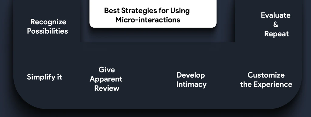
Best Strategies for Using Micro-interactions
The user interface of an online product can be significantly enhanced using micro-interactions. They may give consumers direction, information, and joy while creating a sense of continuity and flow. When creating micro-interactions, it’s crucial to maintain an appropriate equilibrium.
A 2023 user interaction survey indicated that 75% of consumers considered needless or excessively intricate micro-interactions annoying and bothersome. Therefore, how can companies make efficient use of micro-interactions?

Following are some tactics:
1. Recognize Possibilities
The first stage is finding places in the digital product where micro-interactions improve the customer’s engagement. This may include toggles, form fields, loading windows, and buttons. It’s critical to assess where micro-interactions may prove most helpful and where they would hinder the task at hand.
2. Simplify it
When creating micro-interactions, simplicity is essential. Instead of confusing or off-putting users, they want to improve their experience. Micro-interactions must be simple to understand and mixed in with the overall design.
3. Give Apparent Review
Micro-interactions must clarify what happened as an outcome of user activity or the state of the software. A micro-interaction, for example, may show if a consumer’s completion of a form was effective or not.
4. Develop Intimacy
Build micro-interactions that adhere to accepted digital norms. As an illustration, a button that has been tapped or pressed ought to change its look to let the user know that their behavior has been acknowledged.
5. Customize the Experience
Customization helps in micro-interactions to be successful. The psychological connection between the user and the digital product is strengthened. For example, by incorporating the consumer’s name in the welcome message or creating personalized animations depending on user behavior.
6. Evaluate & Repeat
Checking and iterating on micro-interactions on UX/UI design is crucial, just like all other design components. To ensure that changes enhance rather than worsen customer knowledge, get user feedback and make changes as necessary. Last but not least, it’s critical to prevent frequent mistakes while incorporating micro-interactions. These can include employing too many animations, adding extra difficulty, or not taking accessibility requirements into account.
Top Tips for Mastering Micro interaction Design
- Rapid Reaction
A 0.1-second response time maintains the consumer’s feeling of control.
- User Awareness
Users are engaged, and misunderstandings are avoided with a loading bar or status indication.
- Just One Topic
Achieving stability would require developing a common thread to connect all encounters, large and small.
- Consider Situational and User Studies as a Starting Point
Understanding the audience and the setting of the micro-interactions will improve their accuracy and effectiveness. Verify the animations and visual signals are suitable.
- Make it Basic
Don’t add beyond what is essential; when you can, use the pieces already there to provide feedback. Keep your micro-interaction from morphing into a macro-interaction. Don’t try to be too sophisticated; it’s intended to be simple.
- Built for Frequent Use
Create a micro-interaction that is quiet and consistently apparent.
- Employ a Human Voice
A person’s tone in the content will swiftly render your user interface (UI) less mechanical, particularly for micro-interactions focusing on input and data that users urgently seek.
- Observe the Animation Norms
Animation has a unique set of laws and a crucial element of micro-interactions. Review the animation best practices before combining the two since they frequently go together.
Real-Context Examples of Micro-interactions
Micro interactions, despite their tiny form factor, are the highlight of consumer communication in the UX/UI realm. The top micro-interactions and how they affect the UI/UX Design process are listed below:
- Animations
In short, animation makes micro-interactions possible and better. They embody excellent design; while their existence may go unnoticed, their absence hurts everyone. They serve as a glue designers may use to make even the most straightforward procedures engaging and addictive.
However, you must exercise extreme caution since these features should captivate the interest of consumers rather than annoy or frustrate them. Delayed execution or the introduction of an entirely novel website layout might lead to misunderstandings.
- Swipe
Tapping is no longer necessary, thanks to the smoother, more engaging swipe movement. It makes it easier for the consumer to swiftly flip across tabs to discover more about the product. Additionally, swiping is a typical move that directs users instinctively without them even realizing it.
For example, while developing an e-commerce app, multiple product display options are required, which require swiping and scrolling features. Likewise, a doctor appointment app depends on the tiny micro-interactions that ease patient-doctor interactions.
- Current System State
Keeping a user informed of a website’s or app’s current state. Whenever, the customers are not interested, the consumers will become irritated and leave the website or app. Micro interactions provide clear information to the consumer about what is happening, the duration it will require for an activity to conclude, etc. Even failure notifications may be funny while still working to maintain the user’s confidence.
- Call to Action
In essence, micro-interactions stimulate users to engage with a program or site. The best strategy to get users to respond to a call to action (CTA) is to make it interesting and compelling enough to capture their attention. A call to action (CTA) encourages a sense of accomplishment and also emotional aspects of user behavior.
- Data Entry
We’ve all experienced the hassles of generating a password or opening an account. This behavior is prone to raising eyebrows. While proactive advice on password use and safety makes it simple for consumers to carry on, some active participation during information entry can keep consumers interested in the procedure and aid in accomplishing objectives.
For instance, in fintech app development, you may need to add the credentials when making contactless payments. Thus, contactless payments are highly effective with micro-interactions, which help users make transactions much easier without confusion.
- Engaging Tutorials
All of us are always looking for knowledge. With micro-interaction implementation, lectures help viewers grasp how an app works by simplifying and emphasizing the vital functions and settings for quick comprehension.
- Motion Buttons
They serve as the information manager by guiding the consumer around your app or website. To create an intuitive user interface, we must pay close attention to colour, form, special effects, visuals, positioning, and touch. For instance, the motion buttons will be handy when developing a truck booking or taxi dispatch app.
Wrapping Up
Including well-constructed micro-interactions on UX/UI design will become even more essential for producing a satisfying and lasting user experience as the significance of customer-centered design increases. These brief but significant encounters strengthen brand identification, foster emotional ties with customers, and boost customer loyalty and retention, which are advantageous for your company.
In summary, micro-interactions are a crucial component of UX design that may greatly affect the user experience. They give consumers rapid feedback, improve usability, build a psychological connection with them, and help them navigate a product or service. To guarantee they are giving their consumers the best possible experience, UX designers should pay close attention to the micro-interactions in their designs.
Are you looking for an improved user experience? Mindster is here to help you. We are a leading mobile app development company with a strong UI/UX Design team capable of integrating micro-interactions into the everyday mobile app development process. Why wait? Come and join us for the best user experience through the integration of micro-interactions.
Ankitha is a professional content writer with more than four years of experience. She writes blogs relevant to the services that we provide and also about the various mobile app solutions that we provide. With strong research skills and critical thinking skills, she can develop high-quality content that is valid and authentic. She also has good communication skills to interact with the team members to build up-to-date content related to the latest technologies.

