Designing for Success: Fundamental UI/UX Design Mistakes to Avoid
28 Apr 23 

A key element of the business is excellent UI/UX design. It can efficiently lead consumers through beneficial connections and considerably increase conversion rates.
Consequently, mistakes also have a hefty cost. If users are dissatisfied with their experience, the rate of bounces will soar. Even the finest designers occasionally make mistakes with the slightest details.
To assist you in avoiding them in the future, the best mobile app development company is essential. We have identified the eight most prevalent errors. Thus, this blog will cover the eight significant UI/UX mistakes to avoid.

What is UI/UX?
The graphical user interface of a software program is referred to as the “user interface.”
It contains all the user-interactive features, such as text buttons, entry fields, sliders, and other graphical and textual components.
On the other hand, a user’s interaction with the app affects how they perceive it. Is the experience smooth and natural or awkward and perplexing? The ease or difficulty of interacting with the consumer’s interface elements that the UI designers have built determines the user experience.
Importance of UI/UX
The best method for developing a customer-centric product or website is through robust UX design. This will attract new users and keep existing ones and delight customers.
Customers will achieve their targeted results with a pleasant, frictionless, and joyful user experience (UX). They will also keep enjoying your product and spreading the word about you widely.
If users have an irritating, perplexing, or genuinely bad experience, they might quit using your product, cancel their memberships, or leave bad reviews online. Contrastingly, a positive user experience will keep them engaged and satisfied. In a word, creating an excellent UX contributes to the following advantages.
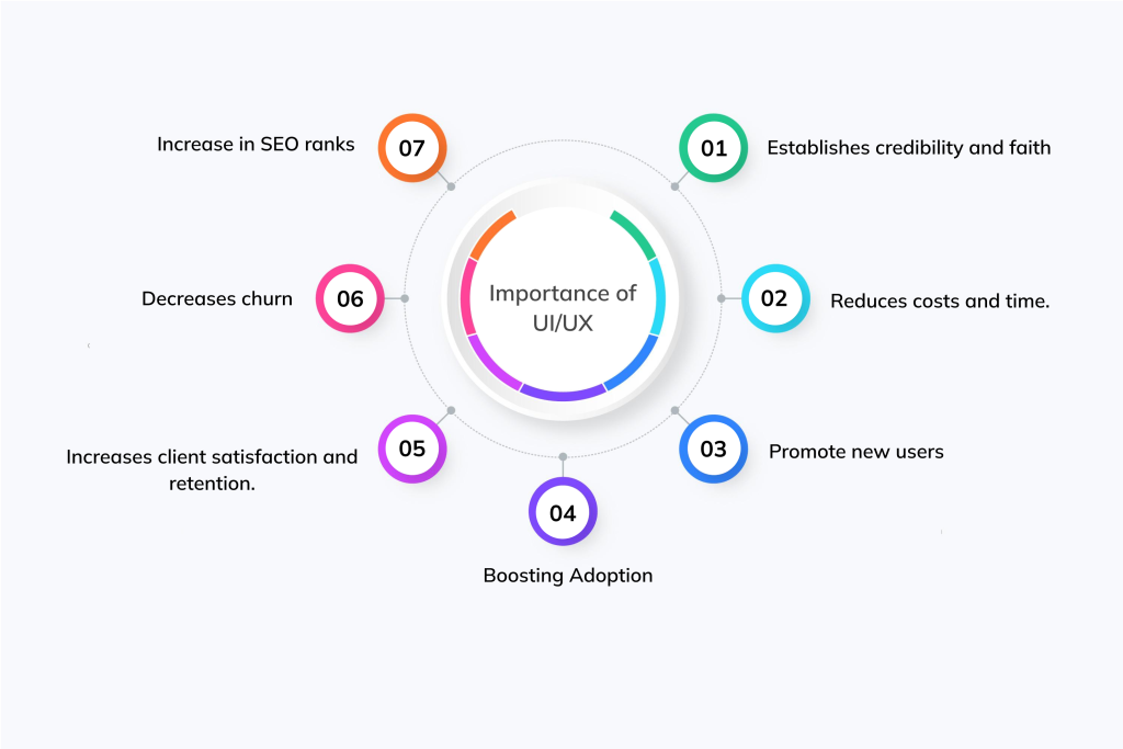
- Establishes credibility and faith
- Reduces costs and time
- Promote new users
- Boosting Adoption
- Increases client satisfaction and retention
- Decreases churn
- Increase in SEO ranks
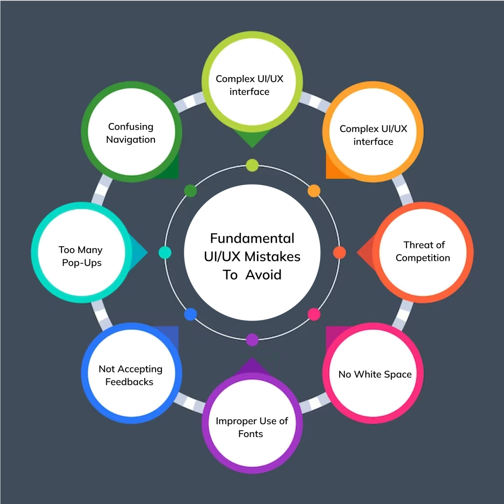
Fundamental UI/UX Mistakes To Avoid
Complex UI/UX Interface
Let’s take a glimpse at all the well-known applications. They all have a simple but attractive user interface.
Airbnb, Zomato, Flickr and Uber are some great examples of the easiest-to-use and most visually beautiful user interfaces.
Everybody desires to live an extremely rapid existence in this cutthroat environment. The modern customer seeks a simple, quick solution.
An excessively difficult or creative user experience will cause them to automatically give up, and they won’t ever be able to successfully stand out on app stores.
It’s vital to reconsider the features and navigational structure while creating an app. For applications with various features, adding more displays may be the answer. For instance, the Airbnb app is renowned for its user-friendly design.
The app divides the user journey into five screens rather than adding functionality to a single screen. Utilizing UI/UX design services is an excellent idea to prevent complicated interface problems.
Threat of Competition
A novel application is more likely to stand out from the crowd than one that has been cloned. The difference between borrowing and copying ideas.
In addition to drawing in customers, a distinctive UI/UX design also has the advantage of free promotion through word-of-mouth advertising. An identical app with knockoff features could damage your brand name.
These UI/UX design principles must be followed by a developer to provide a specific application. Innovative UI/UX design is a requirement, not a perk.
Each app has a unique purpose, requiring a unique design from others.
No White Space
Users may feel overloaded by too many functions and texts. Dynamic capabilities need room to breathe so they can display elements.
Utilizing every available feature can only result in a spike in uninstalls and an unnecessarily complex app.
Google Wave, a software program created by the digital behemoth, flopped spectacularly due to its overloaded interface crammed with features and information.
Use UI/UX Design Best Practices instead of putting every feature you have on a single panel.
Improper Use of Fonts
Most applications are rejected because of poor typographic usage. Your efforts and features become entirely useless if you misuse the fonts.
More than two font styles should never be used because it will annoy consumers and be confusing. Instead, an ordered writing style that is simple to understand can effectively communicate the provided information.
Two diverse font styles are typically sufficient to produce visually appealing material. Every font has a variety of styles, like bold, italic, regular, and more, that can be utilized to readily differentiate characteristics rather than using additional fonts.
Various effective techniques can be employed to create a well-organized text with features.
Not Accepting Feedbacks
There is no denying that businesses that pay attention to customer input stand out from the competition.
Additionally, they have a good reputation in the app stores. Finally, feedback offers ideas from countless minds, whereas designers can only conceive with one reason.
Receiving regular input from users is always beneficial to UI/UX design. Users are the best judges of an application at the moment. Due to user feedback, popular programs like Instagram and Facebook now look differently than they did in the past. Unfortunately, the most common error UI designers make is, by far, not taking feedback into account.
Unresponsive Design
Even though it is nothing new, many apps and websites don’t satisfy the requirements for being flexible and user-friendly across various devices and screen sizes.
Material on various screen sizes and across all platforms is accessible with a responsive design. For example, an online application cannot be used on smartphones without a responsive design.
A responsive design also helps with positive feedback, a reduced bounce rate, more dialogue, greater accessibility, better ranking, and other factors. These ideals cannot exist in an inflexible design.
Too Many Pop-Ups
Nothing repels visitors more than being greeted by various pop-ups when they arrive on your homepage.
Before consumers even begin their journey through the product or website, they are forced to deal with shutting down pop-up windows. This can be frustrating, as it distracts them from getting the information they seek and hinders their overall experience.
Pop-ups aren’t all awful, but you should be wary of ones that are difficult to close and poorly positioned or constructed.
Consider how many you include and when to include them when designing pop-ups for the user experience.
Keep it to one per page if possible, and make sure it doesn’t obstruct the user experience by filling the entire screen. Additionally, your pop-ups should be straightforward to dismiss and reachable with a few clicks.
Confusing Navigation
A developer should appropriately organize the navigation after all the fundamental UI/UX corrections.
A website’s or application’s navigation must be apparent for an intuitive experience and to match visitors’ expectations. The consumer will browse elsewhere if the navigation buttons are difficult to see or concealed by a complicated UI/UX design.
Instead of being in the center of the text, a menu ought to be positioned at the top. A developer must test many navigational patterns to discover the most effective and user-friendly one.
Navigation may be readily sorted and organized.
Final Thoughts
It takes effort to create a fantastic page. Understanding the requirements and demands of your clients adds additional strain to the continual balancing act between form and function.
However, if you avoid these typical UX/UX errors, you’re on your way to producing an attractive and functional design.
Did seeing these UI/UX design errors connect with you as a designer?
These tiny errors are frequently ignored, which is how an irrational design emerges!
Developing an effective UX strategy has the additional benefit of simplifying the subsequent process in specific ways. This is because it enables you to learn how to develop an effective UX strategy from the ground up. If you are looking for an attractive and appealing UI/UX design team, contact us at Mindster.
- Agentic AI1
- Android Development3
- Artificial Intelligence37
- Classified App3
- Custom App Development5
- Digital Transformation12
- Doctor Appointment Booking App14
- Dropshipping1
- Ecommerce Apps40
- Education Apps2
- Fintech-Apps38
- Fitness App4
- Flutter4
- Flutter Apps20
- Food Delivery App5
- Grocery App Development1
- Grocery Apps3
- Health Care10
- IoT2
- Loyalty Programs11
- Matrimony Apps1
- Microsoft1
- Mobile App Maintenance2
- Mobile Apps131
- On Demand Marketplace1
- Product Engineering6
- Progressive Web Apps1
- React Native Apps2
- Saas Application2
- Shopify9
- Software Development3
- Taxi Booking Apps7
- Truck Booking App5
- UI UX Design8
- Uncategorized7
- Web App Development1





Comments